3. An Introduction to Information Abstraction in Dining Apps
Posted on Wednesday, 8 March 2017
#Post #Theory #InformationAbstraction
What is information abstraction?
Information abstraction generally refers to the hiding of certain information from the end-user. These forms of information are generally deemed less important, and that there is actually a benefit in hiding the information so as to provide a cleaner and less cluttered interface for the user.
Information abstraction is necessary in order to provide users with information and data about restaurants, as it is not possible to fit every single bit of information into a small screen, nor is it possible for users to easily visually process large amounts of information and data.
The Challenge
One of the main challenges of information abstraction, in particular within the context of a dining app, is to find out what sort of information is more important to the user in various scenarios, and which types of information can be safely hidden away in deeper levels, or perhaps, completely removed from the interface.
Problems which can arise from Information Abstraction
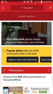
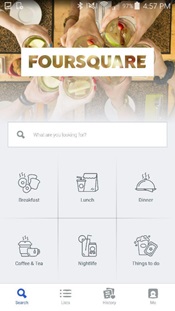
Abstracting certain types of information or categories can form an inconsistency in the user experience. For example, HungryGoWhere chose to suggest restaurants with suitable activities based on the current time of the day, and abstracted away activities which are suitable for other times of the day. From the screenshots shown in Image 2.1a and Image 2.1b, accessing the HungryGoWhere application at 5pm allows a user to select the category of “great after work places nearby”, while accessing the Foursquare application at 5pm still allows the user to tap on “Breakfast” and “Lunch” categories, amongst others.
This form of information abstraction has brought about a situation whereby users who were planning an instantaneous restaurant visit were more likely to benefit, as if a user accessed the application at 5pm, dinner places were suggested, and users who were planning for tomorrow’s breakfast, but chose to access the application at 5pm today, had to go through more taps and pages, and even resort to typing in the search box.
It is arguable as to whether HungryGoWhere’s dynamic start page, which changes based on the time of the day, provides a better user experience for users, as compared to Foursquare’s more static start page. It is likely that different users have different opinions on this. However, this is an important observation made from the case study.
How Information is Abstracted Differently in Different Interfaces of the Same Function
Take a look at the starting screens of these two screenshots, comparing HungryGoWhere's interface with FourSquare's interface. Notice how a lot more information is provided in HungryGoWhere's interface, as compared to FourSquare's interface.
As with many design factors, there are advantages and disadvantages of different levels of information abstraction at different stages of the app, and at times, it comes down to a matter of personal preference, or getting used to a certain interface design.
What's Next?
In the following post, studies in the field of Information Abstraction will be performed. You will get to read about one of the important User Studies conducted with regards to abstracting relevant restaurant attributes. Also, expect to play with some interactive prototypes. Stay tuned!

