8. Listing Restaurants — Introducing Maps and Lists
#Post #LiteratureReview #MapsVSLists #Navigation #UserExperience #UserInterface6
The Vertical List — Scrolling and Scroll Bars
The notion of scrollbars were present since the early 1970s, with Bravo, the first WYSIWYG document preparation program, pioneering it in 1974, by placing buttons on the left margin, which changed shape to a double-headed arrow upon hovering (Lampson and Butler, 1979). Early versions of the Apple operating systems, such as the Lisa and Macintosh operating systems (Apple Computer Inc, 1992), as well as early versions of Windows, featured them. They came in various different forms, but all aimed to solve the problem of displaying more content within a limited real screen estate area.
Image Credits : http://bt.com
Scrolling changed significantly when multi-touch technology became mainstream, thanks to the introduction of the first iPhone by Apple. Users began directly interacting with the content to move the page around, as opposed to interacting with the scroll buttons and scroll bars.
Today, swiping up on a vertical list has become a very common practice with handheld devices like smartphones and tablets. The scrollbars themselves become more of an indicative visual cue with touch screen interfaces, and often, even disappear when not needed.
Image Credits : www.gadgethacks.com
The Map
Map-based listing was made mainstream in the era of touch screen devices, with the iPhone, once again, featuring this new way of representing information, and putting it into the palms of the masses.
Its default Photo Gallery featuring a map view called “Places”, all the way back in 2010 with iOS 4. Pins representing photos were superimposed on the map, as shown.
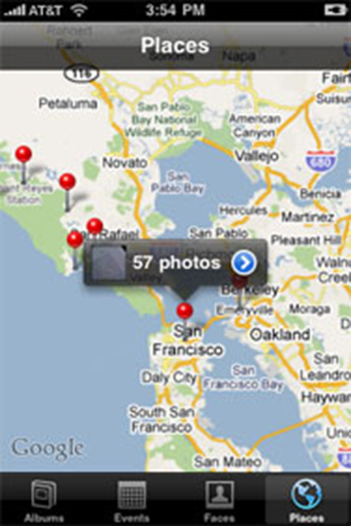
Image credits: http://macworld.com
Mapping applications, being maps, also often featured this type of information representation methodology. A quick search for restaurants on Google Maps brings up an interface where a horizontal panel of cards, going by Google’s material design standards, pops up, and as the user swipes horizontally to scroll through the cards, the map automatically scrolls to the place where the restaurant is, on the map.
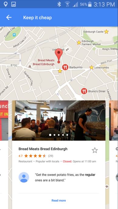
Screenshot of Google Maps
When we are looking at the scenario of a dining app, two main listing interfaces emerge as popular choices. A conventional vertical list, or using a map to visually represent where the restaurants are.
In the next post, we will look at the results of a user study conducted to determine which type of interface is more suitable for the scenario which we have been studying all this while: — Discovering new restaurants in the vicinity, and also for a user to plan for a future meetup, potentially with friend(s), and deciding a suitable dining venue for it.