4. Findings : Which Restaurant Attributes are More Important?
Posted on Thursday, 9 March 2017
#Post #UserStudy #InformationAbstraction
The User-Study
To Investigate the Importance of Various Restaurant Attributes in order to Abstract Relevant Information
As CrayonData has a large database with information about millions of restaurants around the world, a key part in designing the user experience involves presenting the most relevant information to users, and abstracting information which is less important.
This user study aims to
• Determine which attributes of restaurants are most important to users.
• Determine which attributes affect users’ decision on the restaurant / café to the greatest extent.
• Determine which attributes are not important, and can be abstracted away to save real-screen estate.
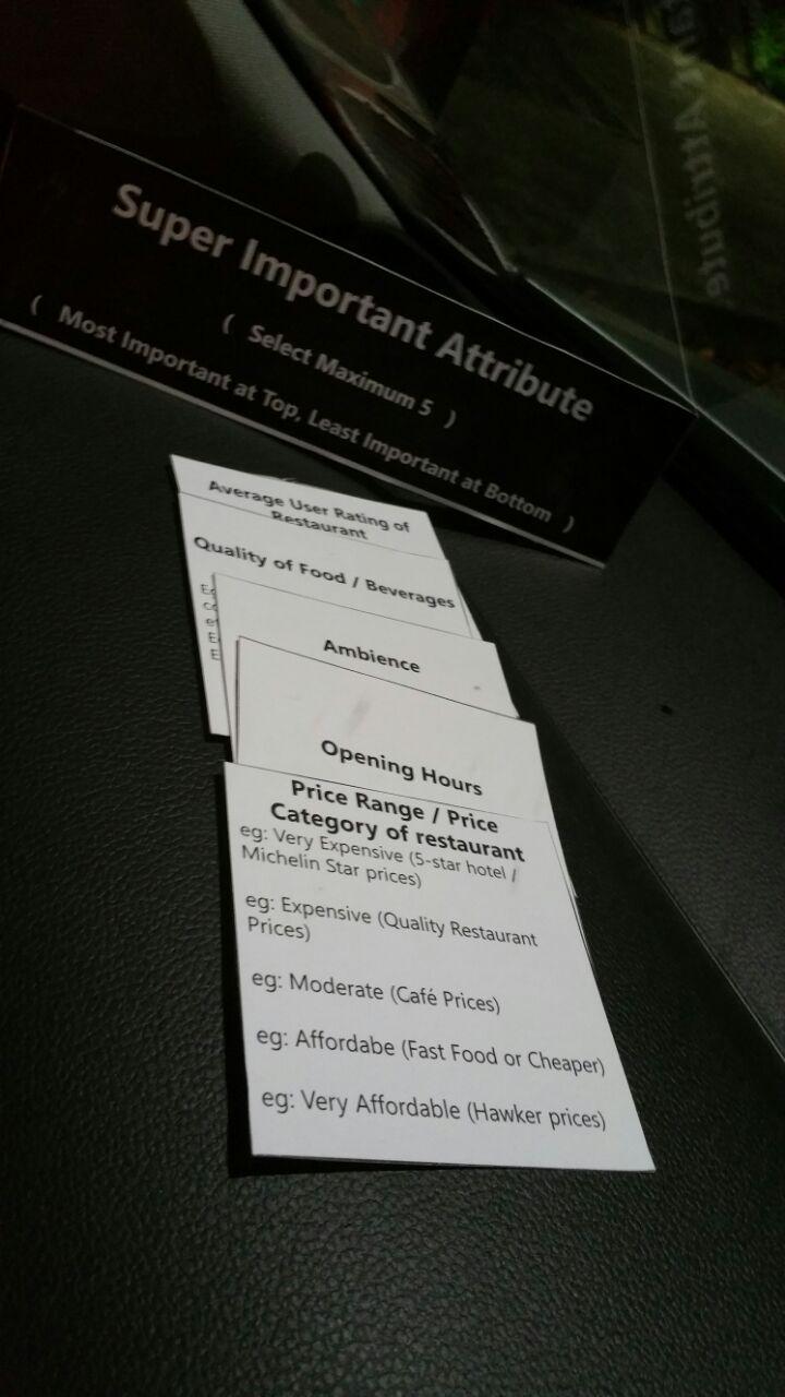
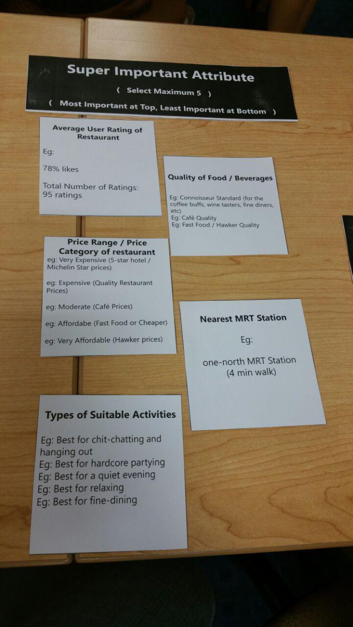
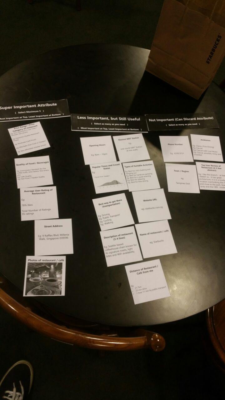
This user study was conducted in the form of a card sorting exercise. 18 different restaurant attributes were selected, and each attribute was made into a physical card. Users were explained the primary scenario, made aware of the meaning of each of the restaurant attributes, and asked to sort the cards into three categories, ranking the importance of each of the individual attributes.
Top 5 Most Important Attributes
Based on the card-sorting exercise, these attributes emerged as the top 5 most important.
- Quality of Food / Beverages
- Average User Rating
- Price Range / Price Category
- Restaurant Ambience
- Photos
A significant number of participants indicated that these five categories of restaurant attributes were the most important, and would most likely influence their decision in choosing a restaurant. A design decision was made based on these results – to ensure that these five categories of restaurant attributes are always visible to the user. These attributes will be displayed to the user as soon as the user begins browsing through a list of restaurants.
Least Important Attributes
- Best Way to Get There
- Popular Times and Crowd Status
- Website URL
Most users indicated that these three attributes are not important. These results allowed for the design decision to bury these less important information in deeper menu and page levels, as compared to displaying them on the top level.
It is important to ensure that although these three attributes emerged as the least important, it is probably not a good idea to completely remove the attributes from the interface. There may be some situations in which a minority of users would still want to view these attributes.
Conclusion of User Study
Information abstraction is an ambiguous decision to make, as there is no clear-cut way to decide on what information to immediately display to the user, and what information to abstract away. The user study provides the investigator with a rough gauge on what most users feel, and aids in the formulation of design decisions ranging from the number of restaurant attributes to display on different pages, and which attributes to provide greater priority to, so as to increase the chances in designing an effective and efficient user experience for the user in browsing for restaurants. These design decisions will be described in greater detail in the next section.
Interactive Prototype : Information Abstraction of Restaurant Attributes
Try your hand at the interactive prototype featuring different levels of information abstraction in the design of the Eat&Drink app!
Interactive Prototype 1 (left) features an interface with very little abstraction (lots of information is left on the screen for easy access).
Interactive Prototype 2 (middle) features an interface with lots of abstraction (lots of information is hidden to provide a cleaner interface).
Interactive Prototype 3 (right) features a compromise between the two, and features restaurant attributes that are deemed to be more important to the average user, based on the results of the user study.
After playing with the three interactive prototypes, you would have noticed that Prototype 1 displays the most amount of information on the very same screen, and all the user has to do is to scroll down or sideways to uncover more of the information. Prototype 2 abstracts the most amount of information among the three of them, hiding some of the less-relevant information away in deeper menu levels, which the user can only access after tapping on certain buttons. Prototype 3 aims to balance the two, and, based on the results obtained by the user study, Prototype 3 attempts to abstract away some of the less important information, while keeping some of the more important information on the front page.
It may be difficult to debate whether or not Prototype 3 is really the best among the three, as it may come down to personal preferences. Furthermore, there have been user feedback that the way the information is represented in all three of these prototypes can be improved further. A detailed study and discussion on the best ways to represent the same information will be reserved for another post!