"The broader one's understanding of the human experience, the better design we will have." - Steve Jobs

9. Interactive Prototype + User Study : Maps vs Lists


Posted on Wednesday, 29 March 2017
#Post #UserStudy #InteractivePrototype #Lists #Maps

Scenario Review

There are pros and cons to both methods of information and data representation, appealing to different scenarios better. In the case of restaurants and dining venues, if one looks at it from the perspective of location (diving deep into the details, such as the nearest street, nearest building, nearest district, etc), then a map view may be better, as the user considers location as the first priority. But if one looks at it from the perspective of other qualities of measure, such as restaurant type, rating, price ranges, or any one of the many attributes that we can use to decide on a restaurant to visit, then the map representation may become less useful, and even over-complicate things.

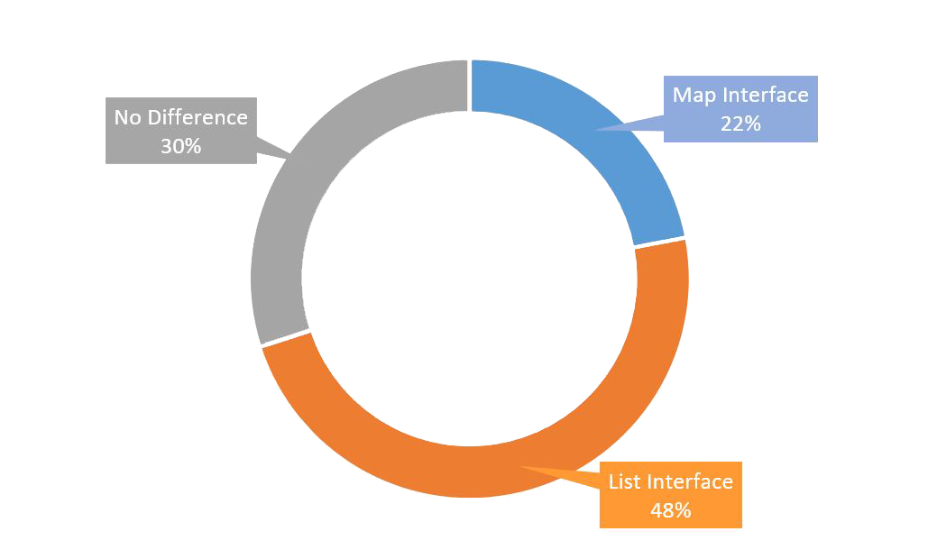
A user study was conducted, focusing on investigating whether participants are likely to prefer a list based interface, or a map-based interface, in relation to the same scenarios. The scenarios are listed here again for reference, and these scenarios follow through all the way from the beginning of the “Designing the Dining Experience” series.

1. Instantaneous scenario

User wants to discover new restaurants and dining venues to visit on an instantaneous basis — meaning right now, or within the next hour or so. (In this scenario, who goes for the meal, and when the meal is to take place, becomes somewhat irrelevant for the app. All the app has to bother about is the ‘where’ portion — which restaurant to go to?)

2. Scheduled scenario

User is organizing a meetup with some other people (possibly friends, etc) over a meal, and this meetup will occur at a particular day and time, at a particular dining venue. (In this scenario, not only is ‘where’ important, but ‘who’ and ‘when’ becomes equally important.)

Before this user study was conducted, participants were made known of both scenarios, and then asked to compare two different sample interfaces which showcase restaurant interfaces. 

These two interfaces have been made into interactive prototypes, and they are embedded at the bottom of this post.

User Study + Results

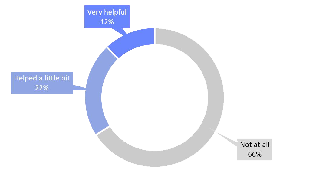
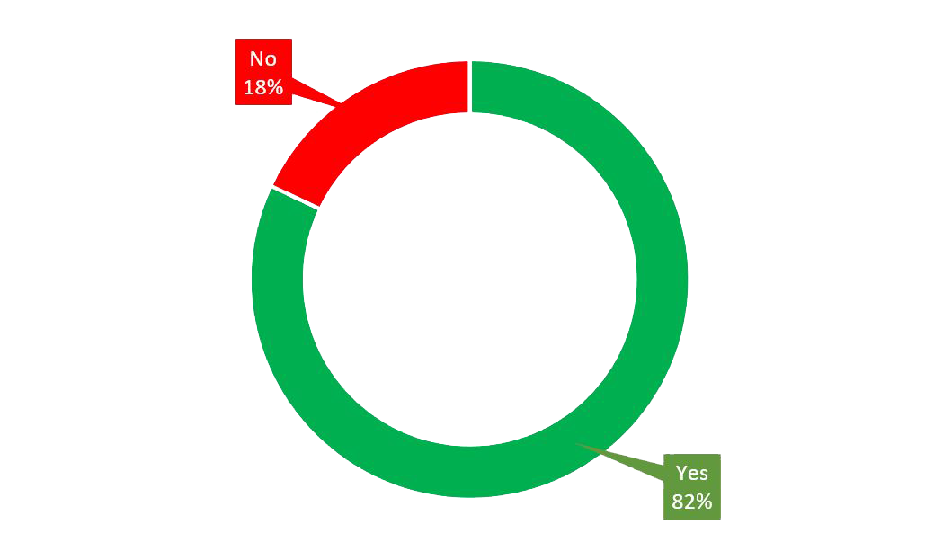
Users were told to scroll through the list of suggested coffee venues, and to select the top-rated cafe which is within 5 minutes walking distance from where they currently are.

They were told to do this on both interfaces, at different times. Eventually, they were asked the following questions regarding which interface was better for the given scenario.

Which interface did you find easier to carry out this task?


Results of the user study, showing the percentage of respondents who indicated a preference for a certain type of interface.


In general, while performing the above task, did the presence of the map help you significantly?

  • Not at all. At this stage, I just needed to know how long it would take to get there.
  • Helped a little bit. Useful to visually see the position on the map while choosing the restaurant.
  • Very helpful in giving me a sense of space and direction.

  • Results of the user study, showing the percentage of respondents who indicated their opinion on whether the map helped them.


    Generally, the map interface has more information visible, while the list interface abstracts away more information, providing a simpler interface. 

    In this scenario, do you think it is worth it to sacrifice some information for a simpler user interface?

  • Yes. A simpler interface for this particular task is sufficient.
  • No. The map provides more information, but this information is important at this stage.

  • Results of the user study, showing the percentage of respondents who indicated a preference for whether or not they would rather sacrifice the additional information provided by the map, for a more straightforward interface.


    Discussion of User Study Results

    The overall results of the user study indicated that people generally preferred the simplicity of the “vertical list interface” over the increased level of information provided by the “map interface”. The list interface emerged as the overall winner, with a larger overall percentage of respondents indicating that it was easier and sufficient to use the list interface in the given scenario.

    In the scenario being studied, it is likely true that knowing the exact positions of the restaurants on the map was not an important consideration, seeing that the interfaces being studied already display more vital information for the scenario, such as the number of minutes of walking required to get to these restaurants.

    Furthermore, when a user is choosing a place to dine at, other aspects, such as its rating, quality, price range and ambience are more vital considerations (as supported by the previous user study on information abstraction of restaurant attributes).

    Several users actually raised the issue that a map-based interface would be a much better fit if the primary use of the app in question was for mapping. Take the example of Google Maps and Apple Maps, where the map is a primary feature, the center of everything. For such apps, it makes sense to use a mapping interface, such as the one seen in Interactive Prototype 9.1.

    However, for an app which aims to cater to other primary purposes, such as recommending restaurants, other forms of information will likely be more important than the geographical location of the dining venues. A list-based interface, such as the one seen in Interactive Prototype 9.2, would also help to standardize the interaction, and reduce the number of different types of navigation techniques present in a single app — this is an important consideration when it comes to good UI/UX design which is often forgotten.

    Interactive Prototype

    Interactive Prototype 9.1 features a map-based interface that borrows many similarities and design cues from Google Maps. Interactive Prototype 9.2 features a list-based interface. In this example, the list-based interface actually features less information than the map-based interface, sacrifising it for a simpler and more conventional vertical-scrolling interface. These two prototypes were used for the user study described above.


    Interactive Prototype 9.1 (left) features a map-based interface. Such an interface provides information on the exact location of the restaurant in question. However, the horizontal-scrolling interface is slightly unconventional.

    This interface may be most suitable for a mapping application, where the map is always present as the primary interaction interface.


    Interactive Prototype 9.2 (right) features a list-based interface. This interface arranges the restaurants according to a specified attribute, which, in this case, and following with the scenario, is the rating of the restaurant.

    Since information about the distance of the restaurant from the user's current location is provided (in terms of minutes of walking required), the general consensus is that this interface already provides sufficient information in this scenario, and there is not much need for a map-based interface.

    Implications

    A design decision was made, and the list-based interface was chosen as the main interface for the dining app.